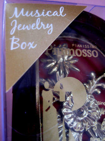
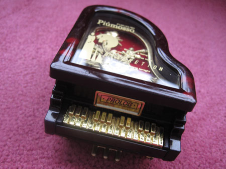
This is the kind of gem I pray pops up every time I enter a 99¢ store. It’s perfect kitsch – cheap, ratty sounding, filled with misspellings and bad translations, completely over-art directed, and way too much gold. There’s even gold on gold, making the title of the product hard to read.
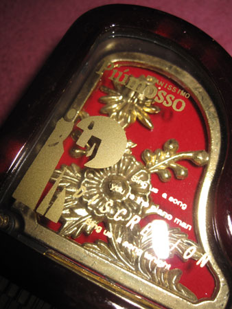
Which is a shame because it has absolutely nothing to do with what’s written around it. (White paper inserted as reading aid.)
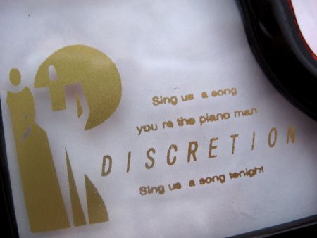
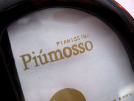
But wait… Is Discretion the name of the Musical Jewelry Box or is it Pianissimo Piumosso?
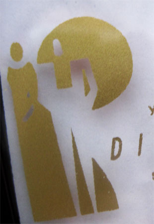
And what exactly is the logo? Is someone with an Afro blowing a candle out? And look at the finger smudge on the candle.
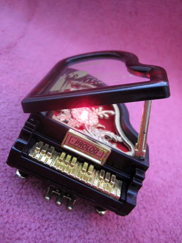
The clunky plastic floral spray against red velvet is another excellent touch. And when you open the piano lid, a red light flashes while Fleur-De-Lis plays, at least I think that’s what the ear wrenching tinny notes are stringing together.
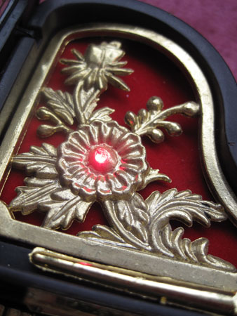
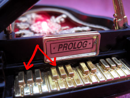
I have long confessed that I have absolutely no idea how to play an instrument despite the fact that music I’ve written has sold over 50 million records. But even I know that nowhere on a keyboard do three black keys occur next to three black keys. As far as flats go, there’s two of them, then three, then two, then three. But not on the Discretion Pianissimo Piumosso!
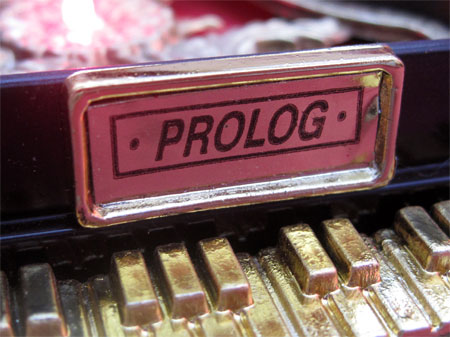
I’m going to assume that the makers of this fine musical instrument were attempting to incorporate the term “prologue” as the make of the piano, prologue being that section of a song, musical or story that sets up the main attraction that’s to come after it. Spelling it wrong however, “prolog” is “a general purpose logic programming language associated with artificial intelligence and computational linguistics.
From a kitsch perspective, the spray-painted flower on the side is an excellent touch. As if enough wasn’t going on on this piano already, the thought of leaving a solid color along the edge was just too much for the manufacturer. The top left petal just made it on.
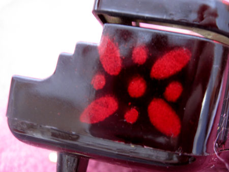
The one on the other side didn’t fare as well:
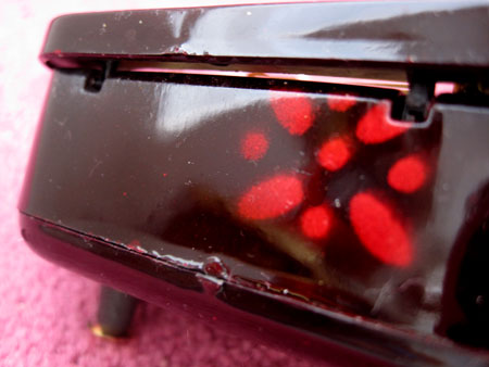
Just imagine the poor person whose job it was to spray these things on as they rolled down the assembly line. High from paint and molded plastic fumes, it’s a wonder anything made the instrument at all.
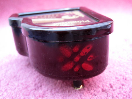
Speaking of manufacturers, the maker of this grand piano music box is listed nowhere on the packaging or product itself, leaving only China to blame.
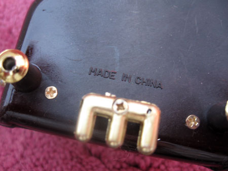
But perhaps the most astounding thing about this product is that despite being clearly marked as a Musical JEWELRY BOX, no compartment is provided for the jewels. Sorry, music box only.
Tomorrow night, I’ll be singing live on stage for the first time since I walked off one in 1974, vowing to concentrate solely on songwriting so I didn’t have to get paranoid about losing my voice, a band member flaking or feeling self conscious in front of thousands of people as I did back then.
My only hope is that when I get on stage at “ The Songs of Our Lives” Concert” in LA tomorrow night, I will appear to be at as high a level of musical brilliance as this Pianissimo Piumosso Discretion ProLog Musical Jewelry Box.

qqqqqqqqq

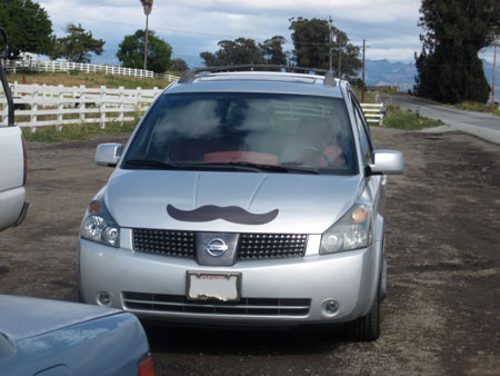
Last weekend, me and Snappy P, a.k.a. Prudence Fenton, jumped into the mustache van and headed up north on a cat reconisance mission after AWMOK‘s own (human) windupkitty sent an email blast from Palo Alto about a very special (feline) kitty in need of adoption. Normally I try not to read these things as I already have a fairly dysfunctional fur family running around Willis Wonderland, but this time, also-AWMOK’s own Snappy P in Los Angeles had been looking for a very special cat who embodied the spirit of her recently departed tripod puss, Harpo, and windupkitty’s description that the kitty in need of a home had an extra wide head, gigundo paws and a few other physical and mental quirks put him squarely in Harpo territory. So off we rolled up the 5 in search of the perfect cat.
Any of you who have ever driven the 5 know that once you’re past Magic Mountain you might as well be tooling through middle America. Other than the too-steep-for-me Grapevine, it’s flat as a pancake most of the way, cows and sheep the only signs of life lest for copycat franchise food and fuel stops completely devoid of the vintage truck stops you wish were still there if you have a bone of taste in your body. For someone who’s thrilled to be in a car because of the potential to spot thrilling kitsch, the 5 is punishment. The good news is that to get to Palo Alto you have to cut over Highway 152 to connect to the ubiquitous 101. And 152 is a fabulous highway, my favorite in California, just long enough to not get antsy and filled with fantastic vistas like this:

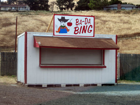
You don’t even mind when the road narrows down to a single lane because that’s when cherry stands start to pop up out of the ground like dandelions after a torrential summer rain:

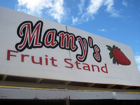
The Bing wasn’t open so we hit one of the other ten or so “pit stops” within a few miles.  I hope this one is pronounced Mamie’s and not Mammy’s:

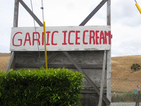
I really wanted to stop at this place for ice cream, especially if the person making it is the same person who made the sign and decided not to finish off the “L” so it looks like gariic ice cream is for sale.

Once we hit the 101 it was smooth sailing despite a disappointing lack of kitsch.  However, the snacks awaiting us when we arrived at windupkitty’s in Palo Alto more than made up for it.

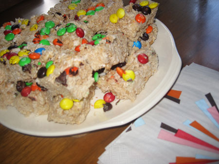
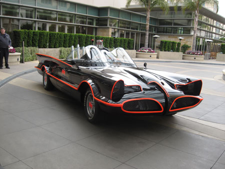
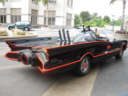
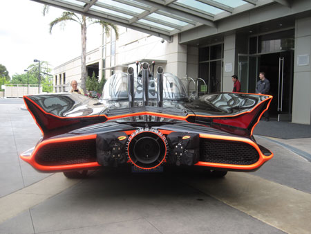
Rice Krispie Treats are infinitely better if laced with M&Ms. And a car ride is also enhanced if it occurs in the Batmobile, parked outside our hotel when we had (a non-Rice Krispie Treat) breakfast the next morning.

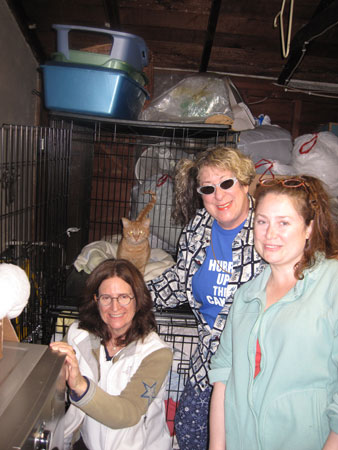
I’m happy to report that the reason for our trip, the cat relocation program, was indeed successful. Here’s a photo of me, Snappy P, windupkitty and the as yet still unnamed new member of the Fenton family right before we piled back into our (non-Batmobile) mustached van and headed back along the flat 5.


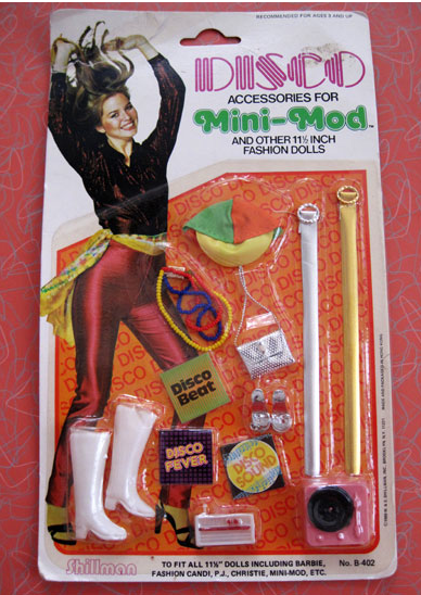
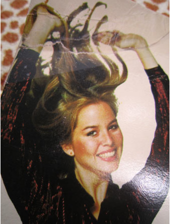
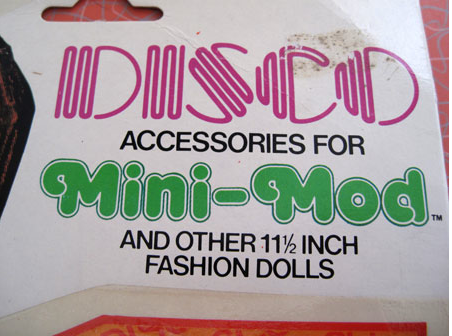
I love these kind of toy kits that are slapped together to take advantage of some current trend because the contents are usually cheaply made and wrong. This card of Disco accessories is no exception. For example, the model with the sky-bound hair looks way more trashy 80’s than stone cold funky mid-to-late 70’s, which is what anyone gracing anything that has the word ‘Disco’ on it should look like. Although I suppose her hair transcends any decade:

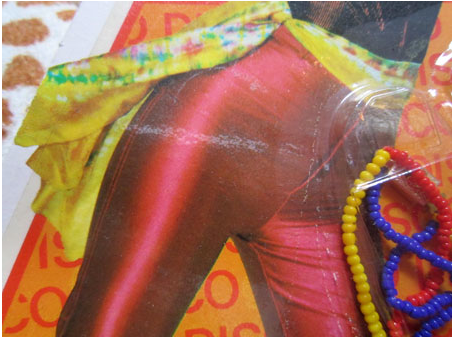
The scarf is a nice touch, though placement on anything other than the neck doesn’t seem optimum for Disco dancing.

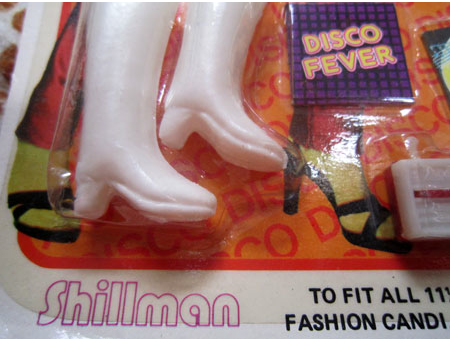
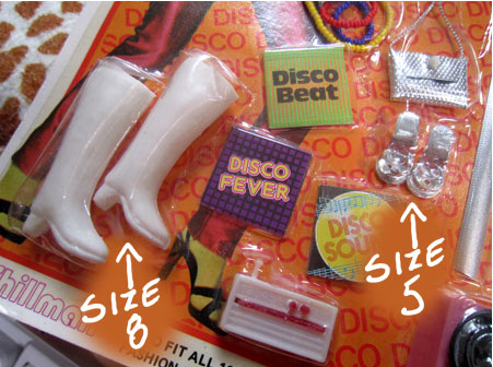
And shouldn’t the model be wearing platform Disco shoes and not heels she might have worn to a tea at the Holiday Inn?! They could’ve at least found a stock shot of someone wearing appropriate footwear. Even the enclosed Go-go boots, tre passé in the the Disco era, are wrong.

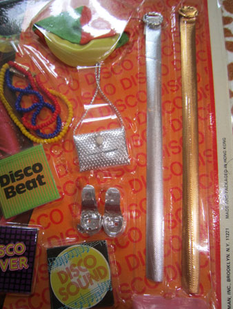
And look at the different belt lengths. Is this in case of the doll’s weight gain or loss?

I guess I can understand that sizing approach in belts but not in shoes. You either have one size feet or the other.

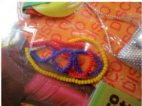
A lovely but somewhat limited selection of jewelry is also provided:

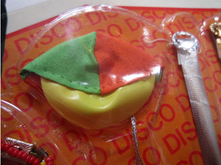
But what on earth is this? A beach ball cover? A beach-themed yarmulke? An example of sloppy stitching?

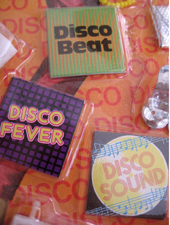
I love that all the record titles have the word ‘Disco’ in them, lest we forget that these are DISCO doll accessories.

At least they got the Disco font right. Then again, the “D” is suspiciously like the ‘O’ so maybe not…

I was much better dressed when I co-wrote this (thankfully) Disco classic:

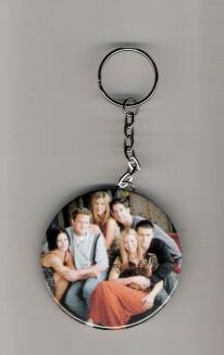
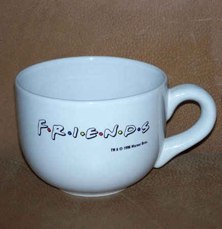
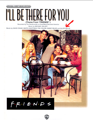
Despite the fact that I co-wrote the Friends theme song, “I’ll Be There for You”, I’ve never collected the plethora of merchandise associated with the show. It’s too new and mass-produced to have the soulfulness of merchandise I collect that came from TV shows of earlier decades, and instead just plops the logo or photos of the stars on the same old cups, T-shirts and keychains that every other post-1990 show on TV stamped their likeness on. Like this keychain that the manufacturer was even too cheap to stamp the name of the show on.

Or this coffee cup:

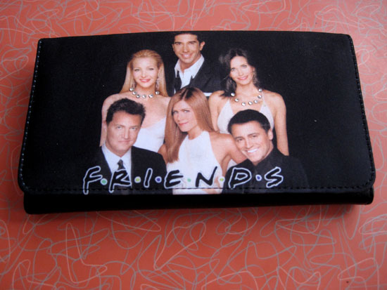
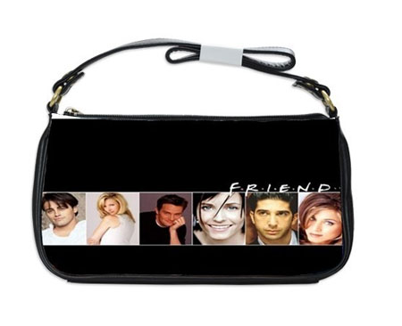
Despite the fact that I really liked/like the show – and not just because I get a teeny-tiny-minuscule-for-which-I’m-eternally-grateful royalty every time it’s on – I never liked the tragically 90’s font of the show title. The only exception is on this incredibly cheaply made purse where the font is beautiful because they left the ‘s’ off of Friends.

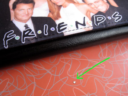
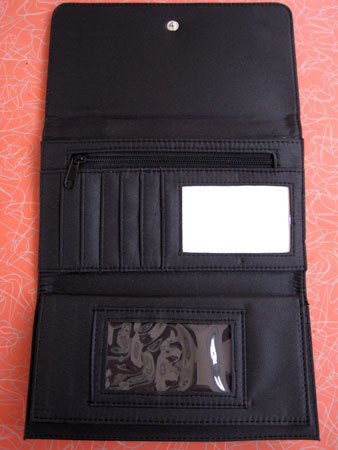
My billfold has the teeny tiniest most minuscule of rhinestones on it, only about 1/16th of an inch in diameter.

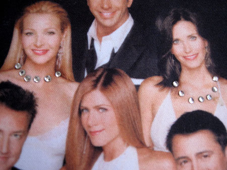
And why was poor Jennifer Aniston gipped out of her necklace?  Although the manufacturer includes one spare rhinestone should the other girls’ jewels be compromised through normal use.

The inside of the billfold has none of the up and frothy sprit of the show:

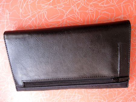
The back isn’t any better:

I’d rather glue the edges of the sheet music together and at least have something distinctive to carry around. And I’d never have to worry about losing it as my name is right there on it

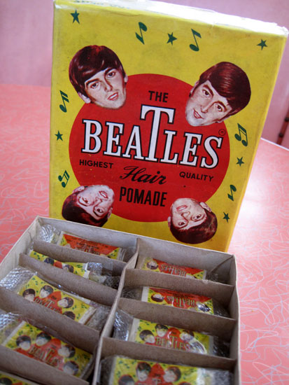
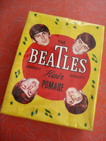
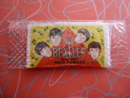
I wasn’t even sure what this was when I saw it on eBay a few years ago but it looked like it couldn’t possibly have been actual sanctioned Beatles swag, and that alone kicks it into a very high level of Kitsch. Besides, just the box – 5″x7″x1-3/4″ with colors so vibrant they make your brain rattle – was worth the 3 bucks it took to procure it.

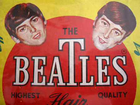
George and John actually look like George and John.

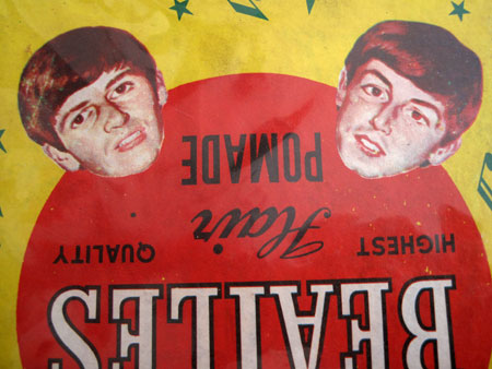
But Paul kind of looks like a cross-eyed Paul and Ringo looks like Paul-but-not-really-but-certainly-not-like-Ringo.

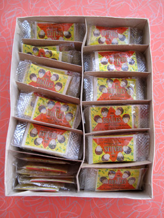
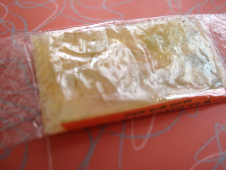
When something comes packaged in the original cellophane as this Beatles product did it absolutely kills me to open it. But seeing as I really had no idea what lay within I had to carefully slice through the cello to reveal this:

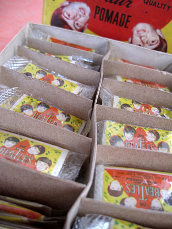
100 tiny packages of Beatles pomade:

Greasy, waxy hair product that the Beatles never would have used on their Beatle hair as the whole point was that it bounced all over their head in rock ‘n roll defiance.  The wax still retains its original squish:

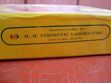
Now that the package is open to reveal the secrets within, my whole house smells like the bathroom at a Chinese restaurant circa 1964. Maybe because it was made on that side of the world that long ago.

That smell isn’t the best smell in the world to inspire brilliant music, which I have to write today, so I’ll confine myself to looking at the  box, not smearing anything on my head, and pray the Beatles vibe enters without rubbing it in with pomade.

Nice, big, fat story in the Times on me today + 12 photos. Thank you, Bob Morris, for seeking me out (no press agent involved here!) and writing such a heartfelt, spirited, and happily long piece. My house thanks you too (at least the part of it that made the photo)!

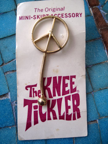
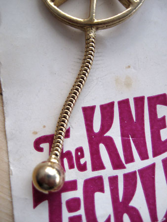
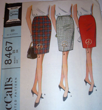
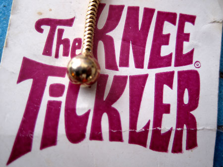
So revolutionary and popular were miniskirts in the 1960’s that a plethora of accessories were made for them. This “Original Mini- Skirt Accessory” is easily one of the more insane ones. I guess the object was to remind you you were wearing a miniskirt when, clipped to the hem line, the little ball swinging from the 1-1/2″ long chain bounced or tick-tocked against your knee with each step.

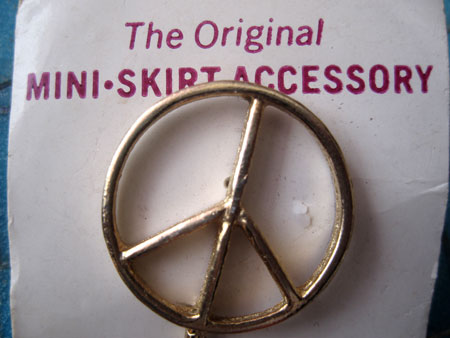
The manufacturer, listed nowhere on the product or card it’s attached to, was trying to combine two late 60’s trends into one – miniskirts and peace symbols, often worn by two different groups of teenagers and young adults.


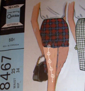
I think the nameless company needed to be a little more generous with the 1-1/2″ length of the tickler if, in fact, it was to hit the knee. The only way this would’ve reached there was with a full-length above-the-knee skirt, totally taking ‘mini’ out of the equation. I’ve enhanced the Knee Tickler to about three times its actual size to demonstrate:

It would actually take ten Knee Ticklers to reach the knee were it attached to an actual miniskirt. I mean no copyright infringement to McCalls but I’ve doctored the image to demonstrate. The Knee tickers are almost double their real size because they’d be too small to see.

I always love a product that merely capitalizes on a craze as opposed to serving any real function. And regardless of whether the little gold ball bangs against your thigh or knee, I would think it was less of a tickling effect than a bruising one after it slapped against your skin all day. It would make a better lapel pin anyway.

But then it never could’ve had such a spectacular name.


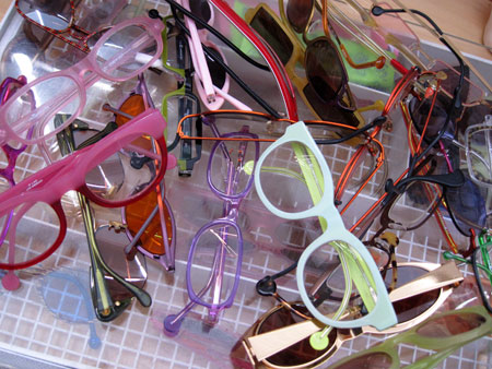
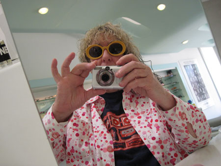
Because I spend about 80% of my day squinting at screens of various sizes and working by the glare of them at night, eyeglasses have been a permanent part of my face for years. This never bothered me as I view these artifacts as part of the self-expression arsenal, equal status if not more to any piece of clothing, shoe or hairstyle used to distinguish oneself in the world. As a consequence, only having one pair of glasses never worked for me.

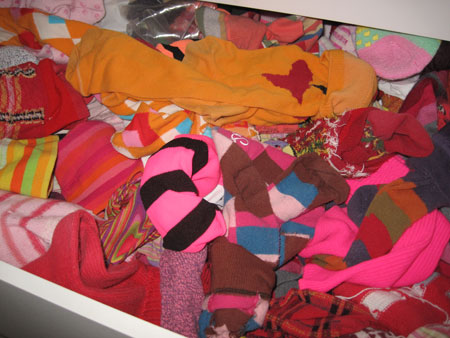
I like to pick a precision match with whatever I have on, the same way that socks always matter but are given so little attention by most people.

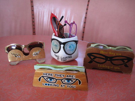
And those are only my red/orange shades. I also like glass holders because I don’t want to take up half my life searching for a pair I’ve laid down without any thought to remembering where that is. So I have a variety of vintage eyeglass holders scattered around for easy pickings.

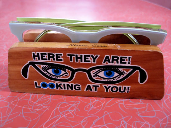
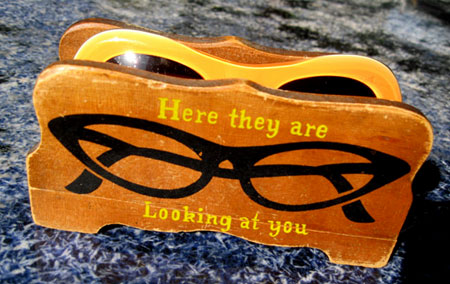
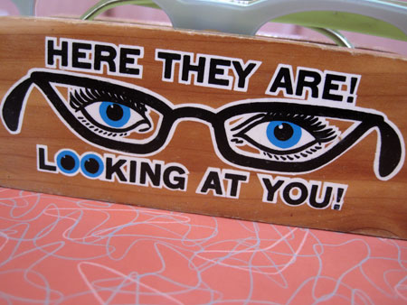
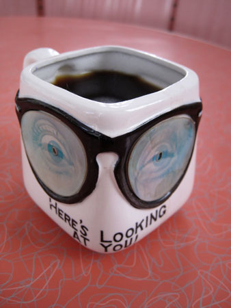
The phrase “Here They Are Looking At You” was apparently very popular among eyeglass holder manufacturers.

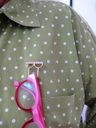
Another type of eyeglass holder lets the glasses swing from wherever you choose to pierce some fabric.

But I love the one I’ve featured today because the colors are so vibrant,…

… and it’s a travel souvenir,…

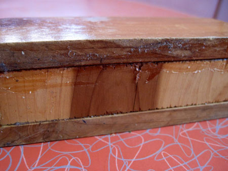
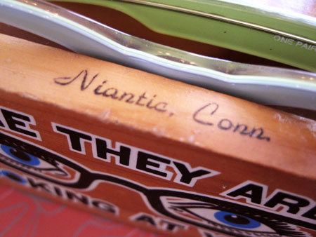
…and it looks very much like a shop project. Judging from the bottom, maybe the city of Niantic planned a little event where all the citizens took part in a night of sawing and gluing.

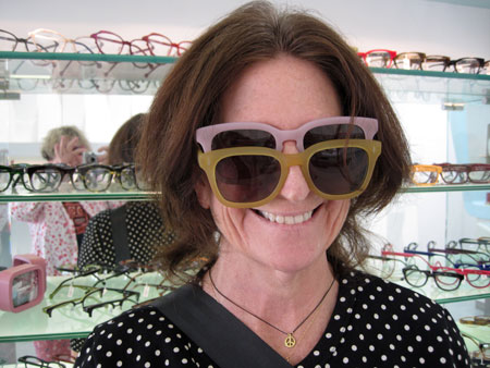
Over the weekend I had to go to LA Eyeworks, where I’ve gotten all my glasses since the early 1980s, to pick up a new prescription.

I went with Prudence Fenton, who also took some specs on a test run.

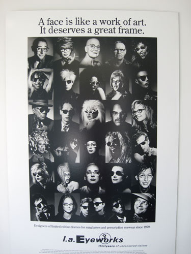
LA Eyeworks makes great frames for very distinctive faces.

And I collect eyeglass holders for very distinctive glasses, all of which are better to see my morning coffee with.

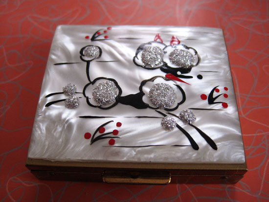
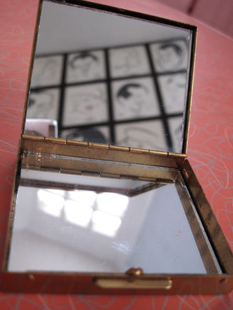
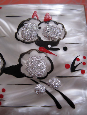
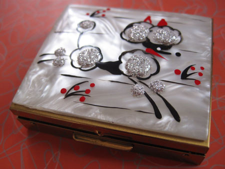
In the spirit of poodles this week, I may as well throw in this fantastically 50’s mother of pearl, sparkle bumped, handpainted poodle compact. I’ve never had powder packed in it but I tote around a variety of small items in the mirror lined case.

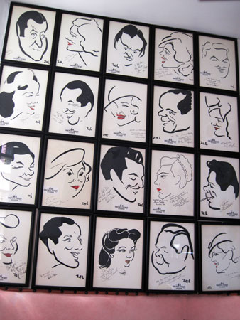
Those are original Brown Derby portraits reflected in the top half.

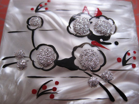
They won’t fit inside the case as it’s a petite 3″ x 4″.  Maybe that’s why the little 3-dimensional glitter tufts of poodle fur look and feel so good, making up in beauty and depth what they lack in stature.

This poodle is happy about her look, painted much more distinctively than most poodles of her decade. I like that her bottom lip looks like a clock hand.

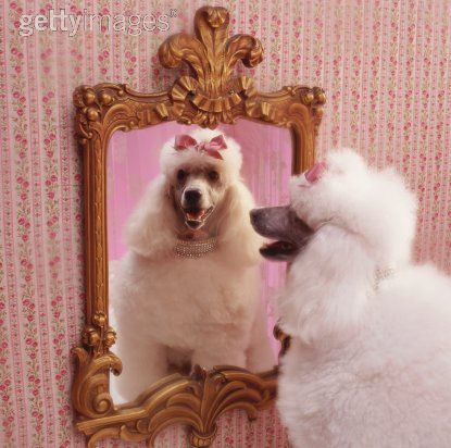
If ever there was an animal created to look at its reflection in a mirror it’s this most distinctive of canines.

I’m actually thinking a lot about distinctive animals today as I’m writing a fairly  twisted kids song with Bleu McCauley and Jasmine Ash for a tv idea we have. We play a porcupine, skunk and platypus. Not that any of them are as attractive as poodles but our animals are very proud that they don’t blend into the kingdom as just another animal.  Just like us.

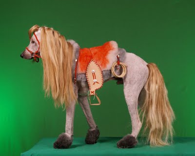
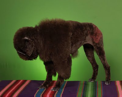
Although some poodles don’t just “blend in”:

Here’s to people, animals and artifacts that hover above the crowd, embracing their uniqueness, with no desire to head towards the over-trodden intersection of Boring and Blending In.

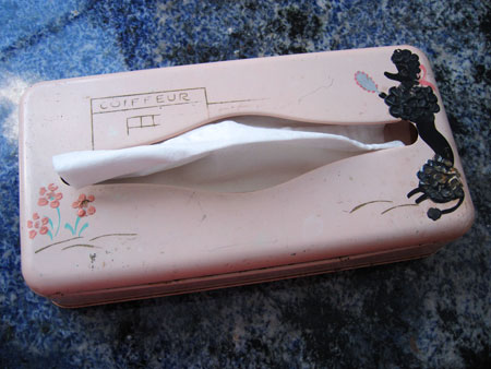
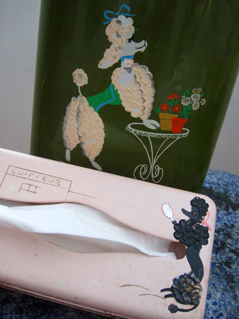
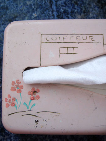
As I said yesterday, I’m not one to randomly collect poodles just because they’re an endearing and iconic symbol of the first totally modern decade to which I am ever beholden, the 1950’s. But it dawned on me as I adopted Fifi the wastebasket that she was a perfect mate for this Kleenex holder that’s been riding around in the back seat of my car forever, always there in my time of nasal need for at least the last decade.

I have a lot of these tin-or-whatever-metal-they’re-made-out-of Kleenex caddies but this poodle coiffeur one has always been my favorite. Somehow poodles fluffing themselves in front of mirrors has always seemed logical.

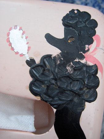
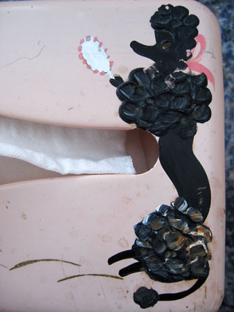
Despite this Fifi missing her rhinestone eyeball she’s still handpainted poodle-perfect.

Had I been the crafter I would’ve gone for tiny little rhinestones around her neck too. But I always admire how they never skimped on the amount of paint needed in order to portray the fur accurately. Though it seems like the bottom of the legs deserved an extra little furball too instead of leaving it at the little tongs that stick out now.

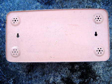
The feet on the Kleenex box itself did get that extra little bit of attention. I love the little air holes pricked into them, though I would hope that any kind of liquid spillage would occur on the tissues only after they were out of the box.