chili-dog-lighted-sign2_2500

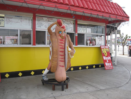
I love lighted signs. Most of the ones I collect are African-American from the 1950’s and 60’s but I also fall for big fat trouts popping out of picnic baskets, gushing motorized waterfalls and the blinking lights of a big metropolis. But my absolute favorite genre which I constantly stop myself from buying because I have no room to keep any more are lighted food signs, not the least of which is this one commemorating one of my all-time favorite snack foods, the chili dog.

I love Chili dogs.

IMG2_1851

This  was consumed two months ago at Cupids Hot Dogs in Tarzana, CA, where the decor is just as good as the hot dogs.

IMG_1857

There are also two outstanding specials offered at Cupid’s that I haven’t seen offered at very many other hot dog stands:

IMG_1843

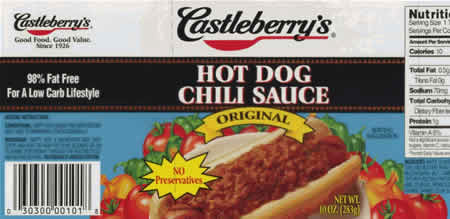
I don’t think Cupid’s uses Castleberry chili though, which is good as in 2007 many cans of Castleberry were recalled for possibly containing Botulism.

Castleberry's_Hot_Dog_Chili_Sauce_(recalled)

As I’m too lazy to cook my own anything this has not deterred me from enjoying a good hot dog stand-bought chili dog every now and then…

chili-dog-lighted-sign_2506

… especially if it comes in the form of a vintage lighted sign.

chili-dog-lighted-sign_2502

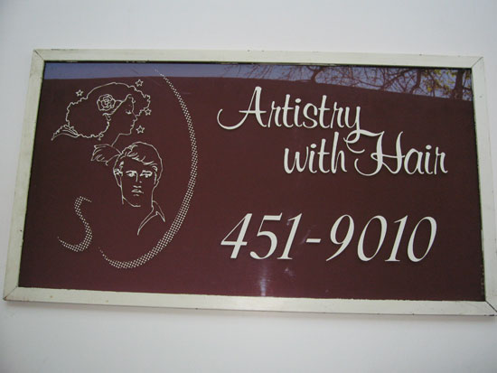
Artistry-with-hair-sign

One sure shot sign of Kitsch is when someone’s idea stops at the first thought and doesn’t spin off into a more creative zone that produces deeper, more interesting and creative spinoff ideas. This holds true with any creative vision, from telling a story to writing a song to thinking of a name for your business.

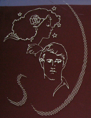
I’ve long been enamored with the mind that’s capable of stopping at the simple, most obvious thought. Like when looking for a name that implies your hair skills are performed with artistry you settle upon Artistry With Hair and a simple clip art logo of an 80’s couple that must have graced signs, business cards and matchbooks in thousands of salons, many of which were probably also named Artistry With Hair or something perilously close, during that decade when this sign was undoubtedly made. And if it was made later than the 80s, double kitsch points for sticking with so dated a look.

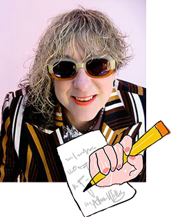
What is just as simple and at the same time not anywhere near as simple – the kind of organic incongruity that’s become a comfortable pattern in my life – is the matter of my own hair which is having its roots touched up as I write this.
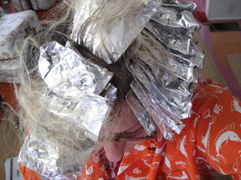
hair-color_2258

Maintaining my hair style is the simple part. I’ve been cutting it myself every morning for 27 years – long on one side, short on the other, shaved part way up the back or not depending on my mood.
aw w statue37

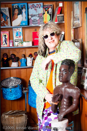
Acquiring the hairdo was the not-so-simple part. After having long, curly even locks for 10+ years, a disastrous trip to the hairdressers in 1984 resulted in a wispy Farrah-Fawcett-flippy-bangs-and-whispy-strands-of-hair-around-the-face cut.  This was 7 years after The Farrah hit which caused me, always style conscious and never wanting to embrace a trend unless I was one of the first ones there, to go into a 31 day lockdown cutting more and a little bit more off one side every day in attempts to find an ideal length.  Finally, I was forced to go out lopsided as months before I had invited a bunch of frends to see the opening screening of Rhinestone, a really bad, kitsch filled film starring Dolly Parton and Sylvester Stallone. When no one even reacted that something very wrong was going on on one side of my head I figured it just looked natural and stayed with it, uncommitted to a perfect length to this day. It led to a fantastic conversation with Farrah about my hair. And here we are 27 years later with me still lopsided. Such is the nature of “Artistry With Hair”.
artistry-with-hair-crop

circus-liquor_0782

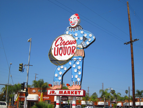
Nothing like using a clown to sell inebriates to get a kid revved up for adulthood. This 26 foot high sign has been a landmark in North Hollywood, CA., featured in enough movies to get a horse drunk. I’m happy whenever I drive by it but still think mixing an icon of childhood with liquor probably happened because the store owner was drunk when he thought of it.

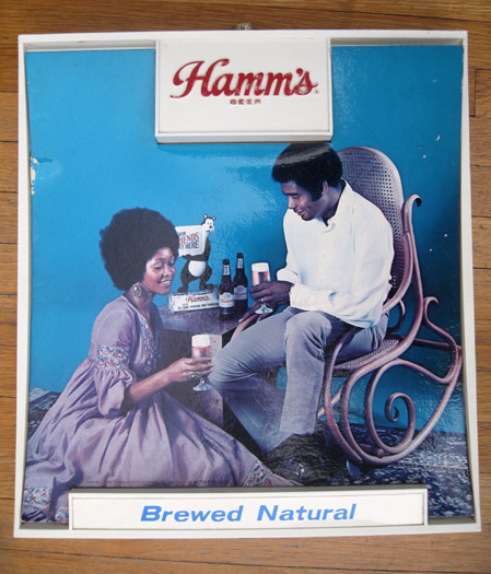
Hamm's-beer-sign_5866

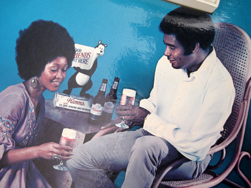
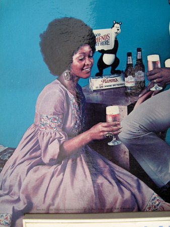
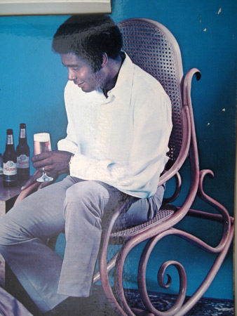
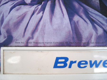
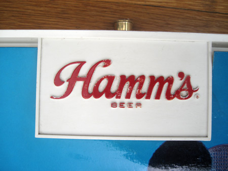
Not quite sure why no chair was provided for the female of the species as by the time this photo was taken for this vintage Hamm’s beer sign in the late ’70’s feminism had surely raised its voice loud enough to demand equality in seating arrangements. At least they’ve got a few beers to tip back this Valentine’s Day so her muscles won’t cramp in that position. Maybe one of her gifts to him is a pedicure. In addition to candy and flowers I hope one of  his gifts to her is a nice, comfortable chair.

Hamm's-beer-sign_5867 Hamm's-beer-sign_5868 Hamm's-beer-sign_5869 Hamm's-beer-sign_5864 Hamm's beer sign_5870

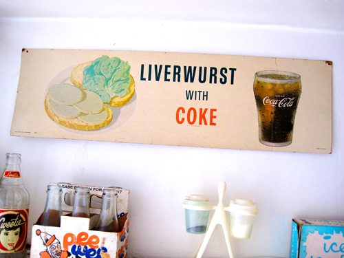
liverwurst-and-coke-sign_1335

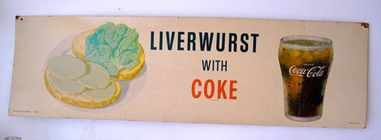
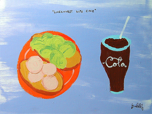
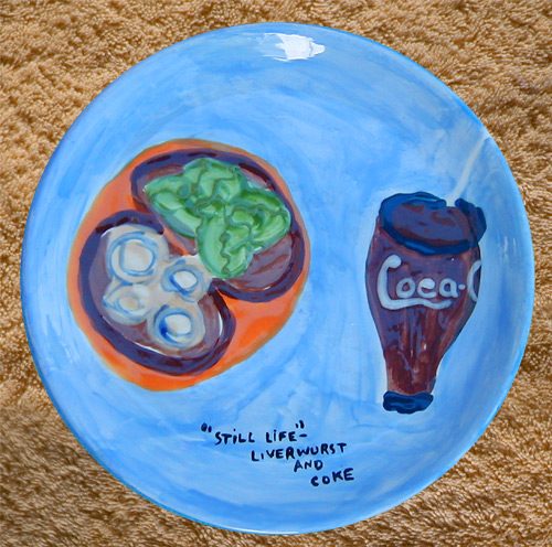
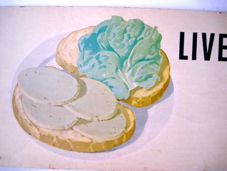
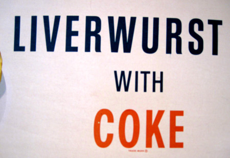
I can’t think of anything Coke would go better with than a nice slab of liverwurst! Not sure what inspired anyone at the company to pick this meal combo to advertise the drink but I’m awfully glad they did because this 8″ x 24″ Litho cardboard sign has hung happily in my kitchen for almost 20 years. I’ve never done it the honor of munching down liverwurst when I pop the cap on a Coke but the sign inspired me enough that my alter ego, Bubbles the artist, painted a beautiful still life of the meal in 1999…

liverwurst-coke-painting

…and soon after also made this beautiful and appetizing dinner plate.

liverwurst-coke-dinner-plate

Both for sale. Actual liverwurst accompaniment is extra.

liverwurst-and-coke-sign_1338 liverwurst-and-coke-sign_1336 liverwurst-and-coke-sign_1337