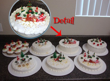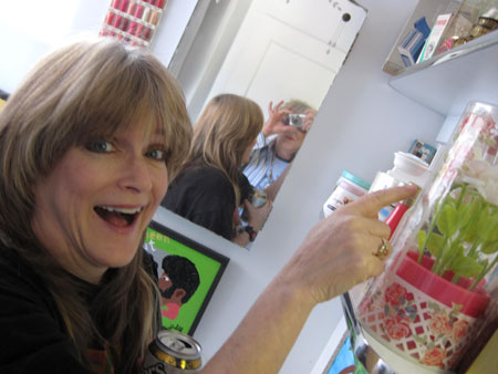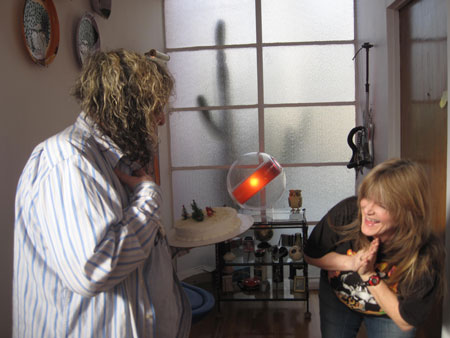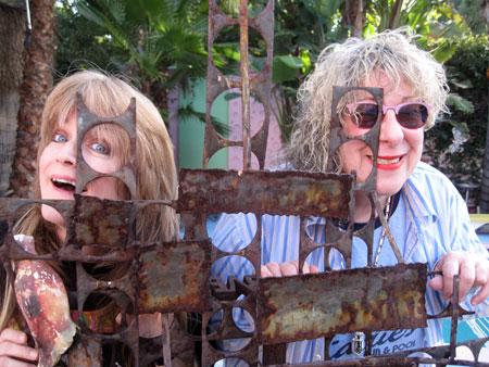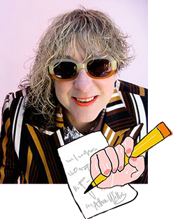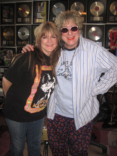
As a collector of kitsch for decades now with a particular love for popular television shows, there’s nothing better than having the real thing who made the real thing in your presence. Such was the case when Susan Olsen, a.k.a. Cindy Brady, the youngest, cutest, blondest Brady in the Bunch, walked into Willis Wonderland last Friday afternoon. And she came bearing one of her signature Christmas cakes, which is how we came to know each other in the first place as she posted her kulinary kitsch koncoction in The Allee Willis Museum Of Kitsch over Christmas.

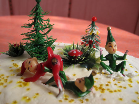
Susan spent over a month (extra kitsch point #1) making these rum soaked (extra kitsch point #2) fruit cakes (extra kitsch point #3). And her description of them was hysterical too. It was an even better sign when I saw the way she prepped her photos. In the land of kitsch, detail insets are most impressive:

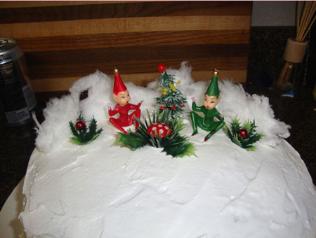
I got especially excited when I saw all the snowy peach fuzz that surrounded Susan’s elves:

But the elves on the cake she brought me needed no such extra set decoration as they got down to enough business on their own:

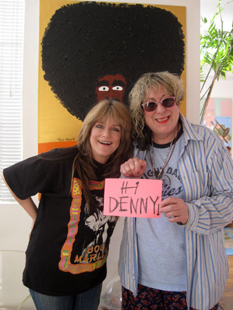
I was actually introduced to Susan by my Facebook friend and most dedicated aKitschionado at The Allee Willis Museum Of Kitsch, Denny McClain. We made sure to give him his props before we did anything else:

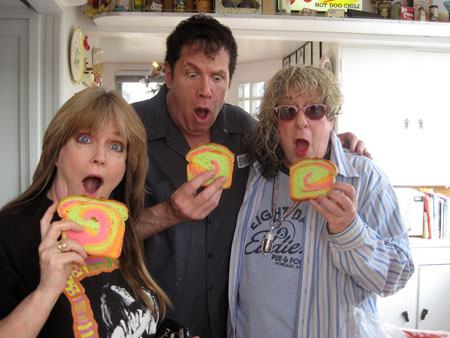
Our hooking up was also facilitated by another Facebook friend, Steven Wishnoff, who accompanied Susan to Willis Wonderland. I immediately offered them a snack as I had something amazingly fitting for this most kitschous of occasions:

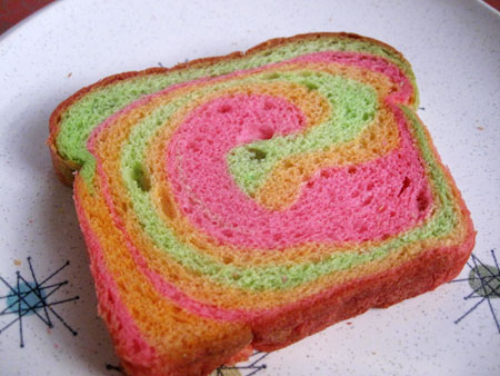
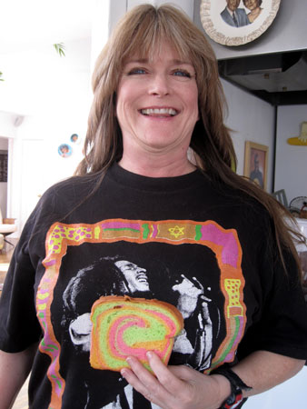
Any of you smart and dedicated enough to subscribe to my blog will recognize that we’re holding a piece of King’s Hawaiian Bakery Rainbow Bread that I bought a loaf of last weekend on my Sunday drive with Charles Phoenix. This is possibly my favorite food discovery of the century so far.

It was perfect as Susan actually came dressed matching the bread:

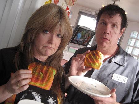
We were all most anxious to see what happened to the color swirls when the bread was toasted, hoping they would get even brighter with a little bit of heat. We were sorely disappointed:

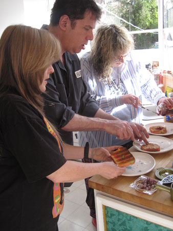
But that didn’t stop us from slopping on some peanut butter and jelly and enjoying a delicious grill stripped rainbow mini meal.

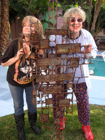
We spent a lot of time walking around Willis Wonderland as Susan and Steven had an excellent sense of kitsch.

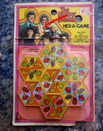
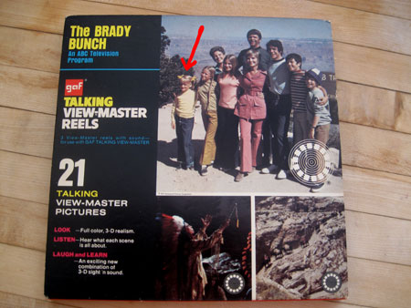
I had much Brady Bunch memorabilia out…

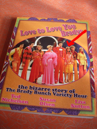
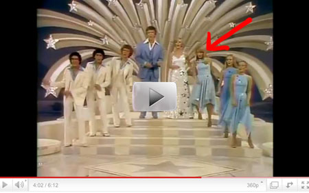
…but I stupidly forgot to ask Susan to autograph anything. Luckily, before we met she mailed me a copy of a book she co-wrote about the making of one of the most exquisitely cheesy television specials ever made, The Brady Bunch Variety Hour.

If you’ve never seen it, RUN to YouTube now!!

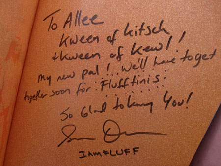
Thank God, Susan autographed the book so I didn’t feel tooooo bad about the missed opportunities for my aforementioned Brady treasures.

All in all, we had a most Brady day!

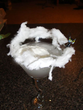
I’m hoping next time we get together Susan will make me one of her signature Flufftinis.

Afterall, there’s SO MUCH we see eye to eye on.

In my youth, Sundays were always for relaxing. But as the years have stretched on, all too many days of rest have turned into days I push pedal to the metal and try to jam in anything I can before the week’s normal downpour of work befalls me. As you can imagine, a nice steaming cup of coffee to start off the day can make it all seem somewhat more civilized. Though not every Sunday…

I’m actually down to 1-3 cups of decaf a day from the 20-30 caffeinated ones I used to throw back when I first started to write songs. In the 70’s, the coffee machine and Pong were the only social breaks for a working musician with a permanent reservation in a recording studio.

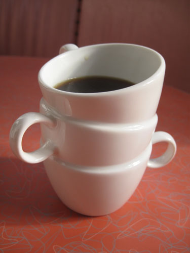
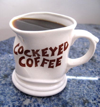
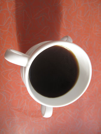
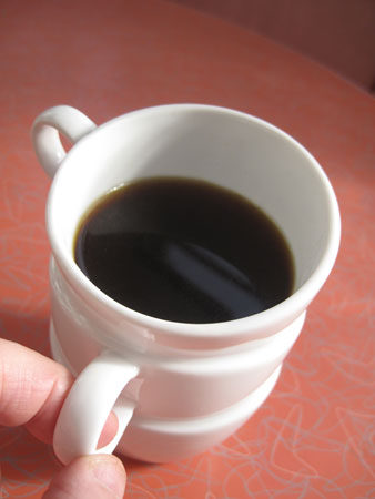
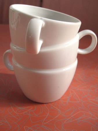
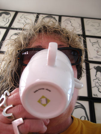
These days, I usually pour a cup as soon as I wake up.  Then I sit down at my computer and go through an average 100 emails, curate and post at least ten new artifacts submitted to my social network, The Allee Willis Museum Of Kitsch, not to mention dealing with two Facebook pages, a Tweet, feeding three cats, getting my assistant up to speed for the day’s tasks, and returning any phone calls to people still living in the Stone Age who don’t email or text, none of which accounts for the songwriting, art, video, animation or other duties that constitute what my real work is that I need to prep for each morning.  All of which gets me to the bottom of an average cup of decaf before I’m a tenth of the way through.  Which is why this triple size stack is the answer to my prayers.

Also, for someone as lazy as me when it comes to exercise, saving the ten steps from my main computer to the kitchen for a refill is to be considered.

I also like looking sharp while sipping.

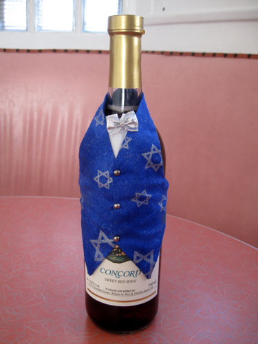
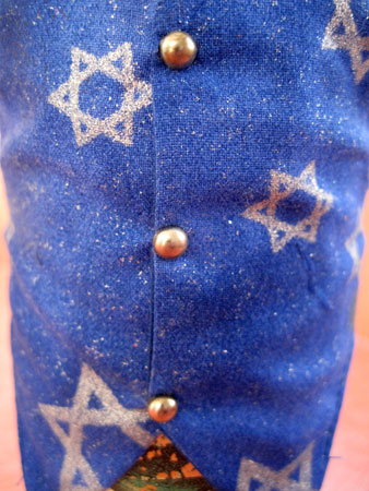
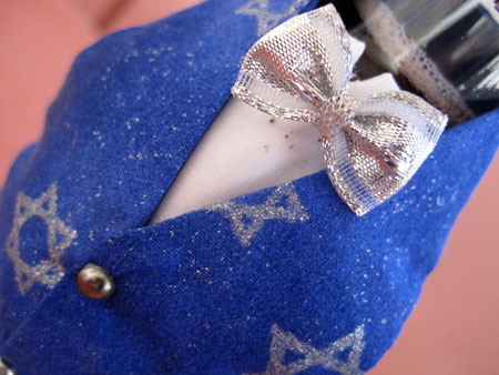
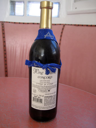
Any bottle of Concorde grape looks more Hanukah with this cheesy little so-much-silver-glitter-you-could-scrape-your-finger-on-it Jewish star vest.

Complete with bow tie, this Wine Butler, “Fine threads for your whites & reds…”,  was manufactured in 1995 for the Perfectly Packaged Corporation, who even has a patent on the thing.

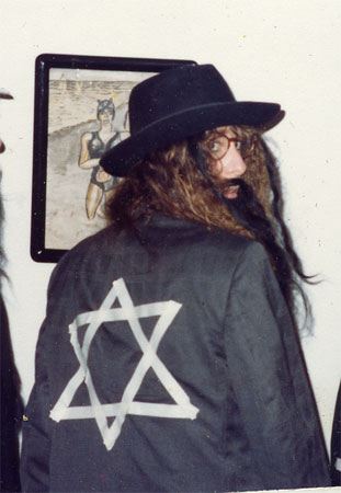
Though my garb was nowhere near as festive as this bottle’s I, myself, was once swathed in Jewish stars when I dressed as a rabbi for Halloween in 1982.

As it’s the last day of Hanukah, it’s now time to retire the wine wardrobe until next year.

Happy last day of Hanukah! May you be well dressed throughout the year.

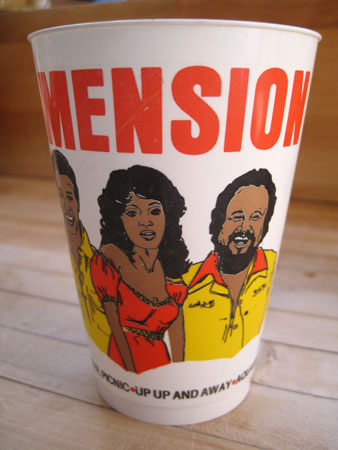
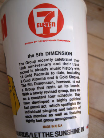
I absolutely loved The Fifth Dimension. I loved Jimmy Webb and I loved Laura Nyro, the songwriters who wrote some of their biggest hits, both of whom were major influences on my songwriting career and the latter of whom was one of the first artists I worked with when I got a job at Columbia and Epic Records fresh outta college. Nyro wrote songs like “Wedding Bell Blues”, “Stone Soul Picnic” and “Save The Country” while Webb wrote The Fifth’s first major hit, “Up Up and Away”, as well as “Carpet Man”and my favorite though slightly more obscure Fifth song, “Paper Cup”.

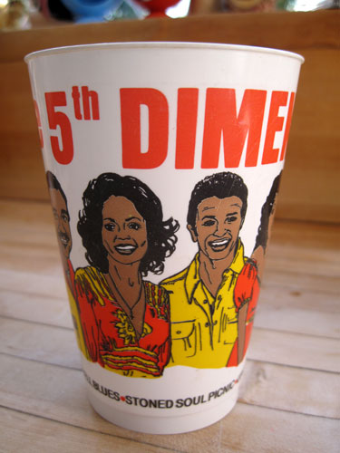
My 7-Eleven Slurpee cup may not be a paper cup but it’s plastic and lasts forever which seems like it would have been a more appropriate kind of cup for Jimmy Webb to write about crawling into and wanting to live forever.

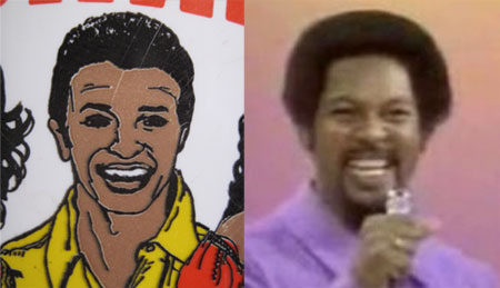
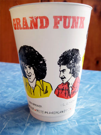
The likenesses on this plastic Slurpee cup bear little resemblance to the real persons.  For example, here’s Billy Davis, Jr. in plastic next to Billy Davis, Jr. in real life:

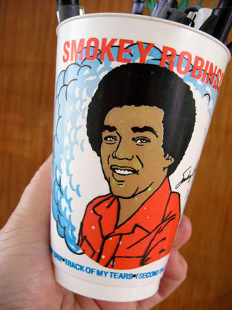
They didn’t even get his signature pencil-thin-mustache-that-turns-into-a-goatee and certainly shortchanged him on his Afro. 7-Eleven did a better job on some of the other 1970’s rock star Slurpee cups I’ve collected:

Though neither Smokey Robinson nor Grand Funk seemed the types to merchandise themselves by aligning with a convenience store, especially as this kind of stuff was rare in the 1970’s, but maybe they liked Slurpees as much as I did. The Fifth Dimension seemed a more likely choice because of their sugary and delicious pop sound.

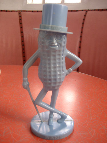
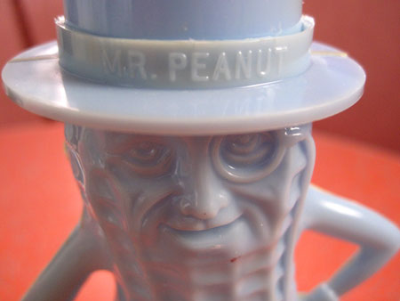
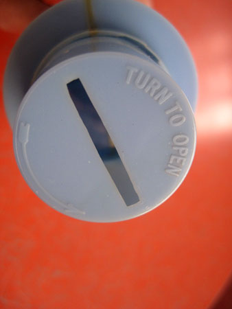
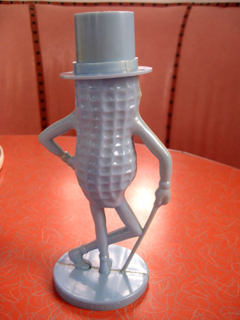
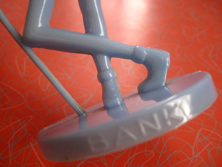
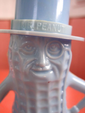
Although I’m not a massive fan of actual peanuts, I’ve always loved classic 1950’s plastic Mr. Peanut memorabilia. I love how the plastic glows with depth from the richness of the classic 50’s colors he came in, in this case perfect baby blue.

I also love the sound of coins dropping into Mr. Peanut’s all too small empty plastic gut.

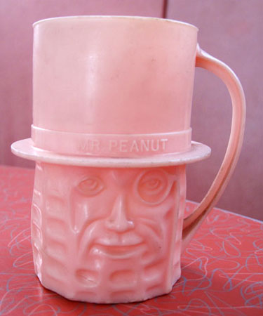
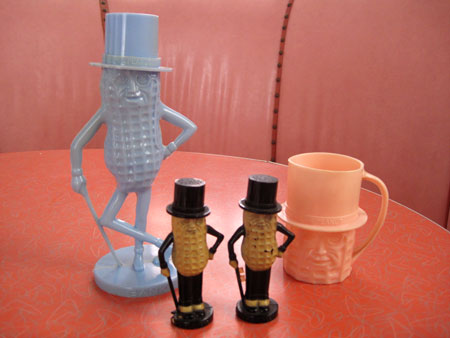
The only other Mr. Peanut memorabilia I collect is also made of plastic. I have this cup in pink, yellow, red and the bank mate, baby blue.

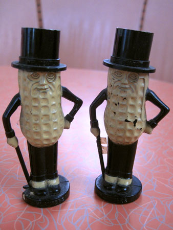
I also have Mr. Peanut salt and pepper shakers. I love them for their diminutive stature compared to the bank and cup, but they stay too close to traditional peanut color and I like things that break more out-of-the-box.

I love Mr. Peanut’s stance.  He’s so casual.

I especially like his little thin legs and rolled down socks.

And he always looks so self-assured.

For all these reasons I like having Mr. Peanut and his multiple selves around my kitschen.

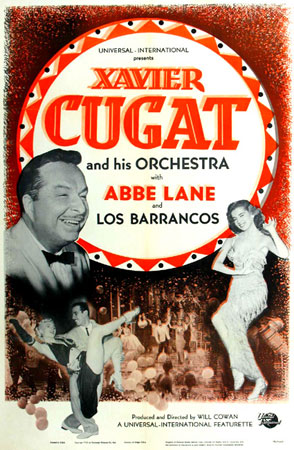
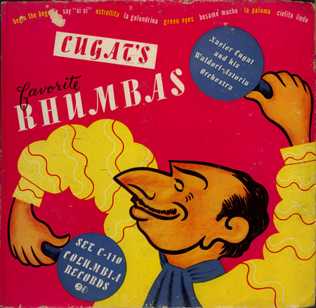
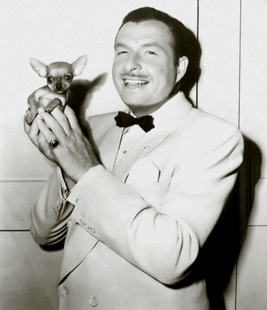
Revered as much for his marriage to cuchi-cuchi girl, Charo, as for his spreading the gospel of bouncy  Latin music and rhythm, Xavier Cugat led the band at New York’s Waldorf Astoria Hotel and toney resorts around the world with his signature batons, one of which was real and the other of which was his pet Chihuahua. Cugat was a multimedia artist before his time, a musician, painter, cartoonist, movie star, business man and ladies man, husband of five steamy women, including the lead singer of his orchestra at its height, Abbe Lane.

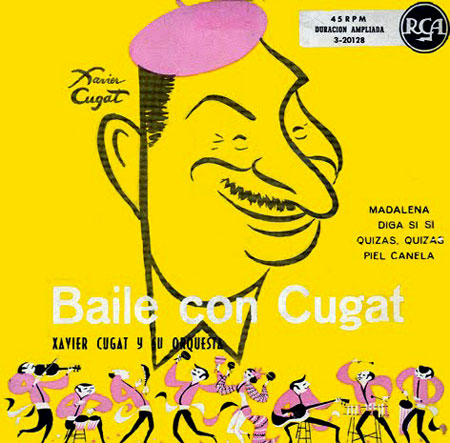
Legendary enough to be mentioned in the third scene of A Streetcar Named Desire, his name frequently sprinkled throughout I Love Lucy, and even a Ben & Jerry’s ice cream flavor named after him in an episode of The Simpsons, “Xavier Nougat”, Cugat  brought such exuberance and flair to a performance that his signature Tango, Rhumba and Merenge rhythms will forever be recognized, as will his self portrait caricatures.

You gotta love a guy who leads a band with a Chihuahua…

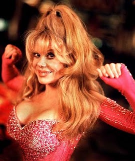
… and marries this:

Cugat was a happy man.

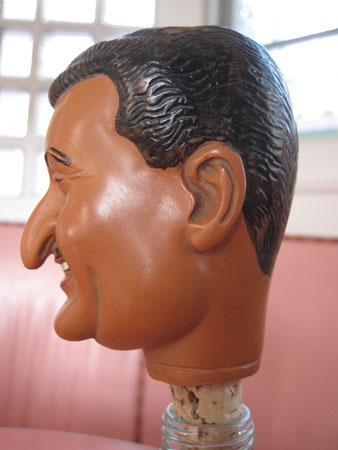
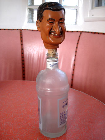
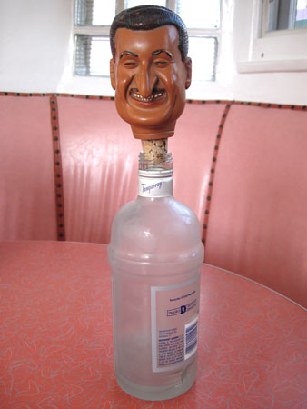
And I’m toasting him today.

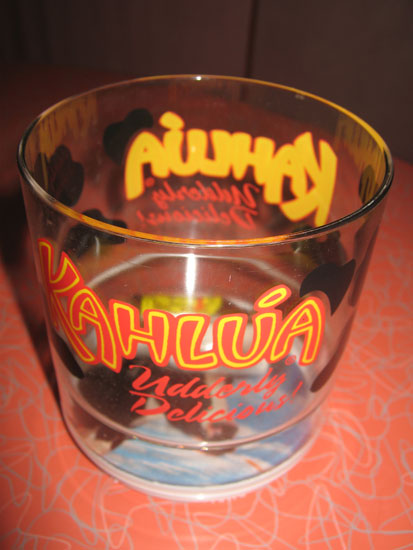
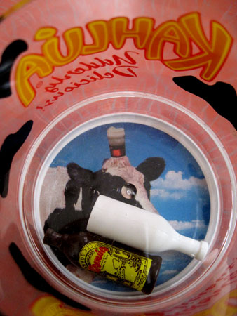
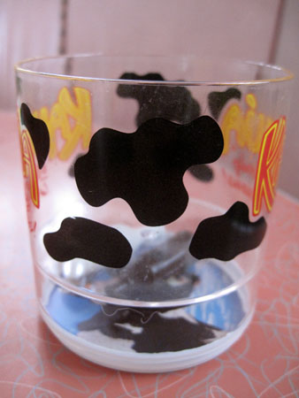
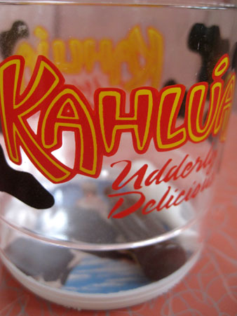
There’s absolutely nothing right about this insanely cheesy Kahlúa “Udderly Delicious”plastic glass which, unfortunately, there’s no way of taking a photo of and showing all the brilliance of at once. At first glance, it’s just an incredibly cheap cup with the Kahlúa logo and some cow spots painted on it. Plus the excellent “Udderly Delicious” slogan. But then you peer inside and see the creature that the udders belong to with a nice frosty drink on its head and two toy bottles, one of which is unmarked, which makes no sense for something that’s a promotional item, rattling around inside on top of it.

As beautifully kitschy as this cup is, one sip from this thing and I would be over the novelty quick as plastic knocks against plastic every time you take a swig, making for an all too loud clunking sound happening way too close to your ear, not to mention that it looks like the bottles are going to fall into your mouth. All of which makes for a perfect kitsch drinking experience should you be up to the task.

Thank you, aKitschionado Denny McLain, for sending this Kahlúa kitsch my way. You are all the more “udderly delicious” for it.

.lombardos-day2

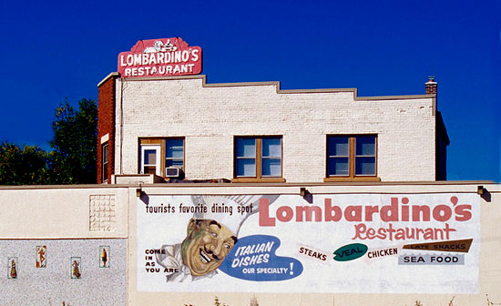
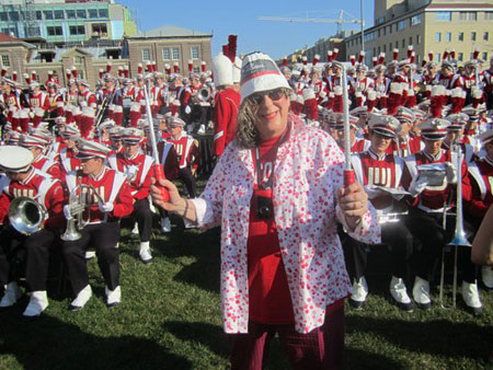
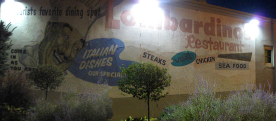
Other than I didn’t have a car so my world was very small when I went to college at the University of Wisconsin in the late 60’s, I don’t know how I missed Lombardino’s. Built in 1954, not a lick of this old-school Italian kitsch fest has changed since. Which is a real feat as the restaurant was bought in 2000 and a very fancy chef brought in. So although the ante’s been upped on the food, not a mosaic tile, not a twist of wrought iron, not even a cheesy slogan has been updated. This is a rarity in this day and age where new owners feel compelled to modernize and squeeze the last drop of soul out of their purchases. Here now is a brief tour through Lombardino’s, where I ate right after I conducted the marching band at the Homecoming football game last weekend.
aw-conducting-pregame-sm

First of all, there’s the Lombardino’s sign painted on the side of the building. The restaurant is on one of those corners, University and Highland, that you pass all the time if you drive in Madison. The sign is a good 40 feet long and not a dab of paint has ever been applied to restore it. This is something that most people can’t keep their hands off of but it’s something that aKitschionados, collectors and architectural historians in general praise. Let things age with dignity, just like a human being who doesn’t pump themselves full of Botox, silicone or anything else that eventually cosmetically alters them into a Stepford wife.
lombardos

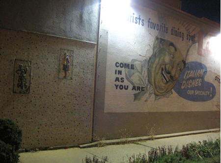
The sign connects to an equally long wall made up of multicolored 1 inch mosaic tiles, the same colors as in the mural so, all in all, a perfect color palette, albeit a little too dark to see well in my photos.
Screen shot 2010-10-14 at 9.15.39 AM

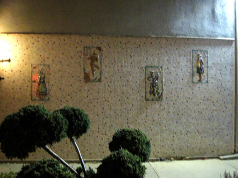
Ceramic reliefs of figures I don’t know to be particularly Italian but I could be so wrong about pepper the tile wall leading to the entrance of the restaurant.
lomdardos_2636

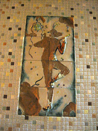
Here are some close ups:

lomdardos2_2638 lomdardos_2640

It’s always a beautiful thing when someone keeps their fat fingers off trying to restore something historic, a move that can only make the actual value plummet, and they choose instead to just leave it to age naturally. In this case, the ceramic relief fell off but you still get the spirit of the party-going figure who once attended the side of the building.
lombardinos_2639

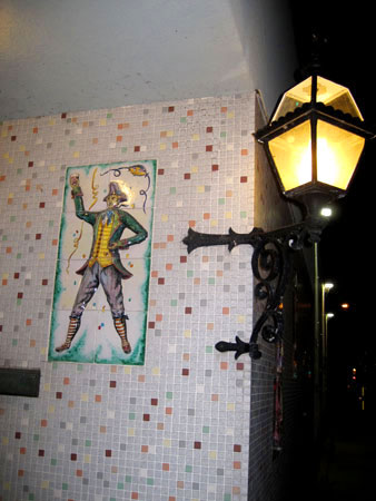
As you swing around the corner to get to the front door, which I unfortunately forgot to photograph, you get a hint of the wrought iron craziness that goes on inside.
lomdardos2_2642

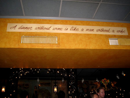
I also forgot to take an overview shot of the restaurant when I walked in. Duh… But I was still euphoric from standing up in front of 82,000 people and a uniformed-to-the-nines 300+ piece marching band and conduct them playing my songs, all of this without knowing how to read music. So these brain lapses are to be expected.  But I knew I was in the right place to celebrate when I saw this slogan on the overhang entrance to the bar:
lomdardos2_2645

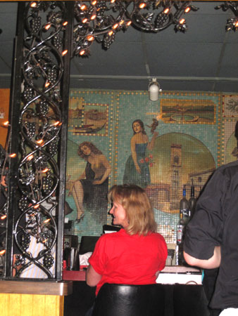
Tipping the camera down a little bit you can see that the wrought iron entrance is made up of a lot of grapes and Christmas lights. It’s always an excellent sign when Christmas lights are left up all year round.
lomdardos_2649

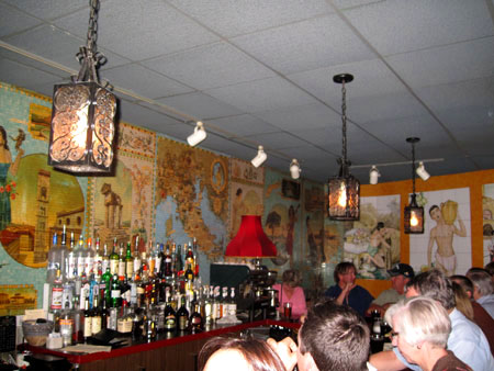
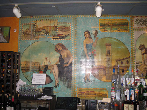
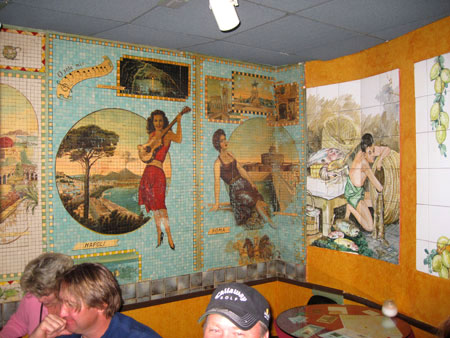
Once through the portals, there are two walls worth of astounding mosaic  and larger tile work.
lomdardos2_2652

The ones made up of one-inch mosaic tiles are my favorites. Mr. Lombardino obviously loved his women.
lomdardos_2584 lomdardos2_2587

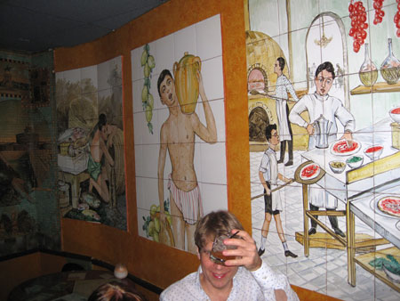
The scenes made up of larger tiles are pretty great too. I especially love the miniature pizza boy standing at the side of the table next to the actual diner who’s cooling his head with his Bloody Mary:
lomdardos_2589

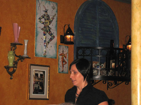
The ceramic reliefs continue inside as do lots of little shuttered windows with wrought iron balconies. It’s always an excellent sign of kitsch when window treatments exist where there are no real windows and balconies exist only to have wine bottles hang out and peer at the guests.
lomdardos_2646

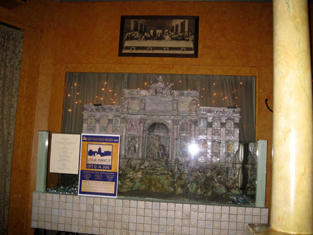
I’m assuming this big tile relief, at least 8 feet long, is some famous building in Rome but world traveler that I’m not, I can’t be sure:
lomdardos_2644

Another earmark of kitsch is when artwork such as this is backlit with Christmas lights and used as a bulletin board with guests at the Last Supper looking down upon it.

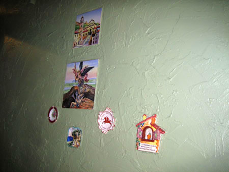
I’m pretty sure that this is on a wall leading to the bathroom:
lomdardos2_2643

The two larger tiles make sense in the scheme of things but I’m always partial when ashtrays are haphazardly stuck in to enhance the design.

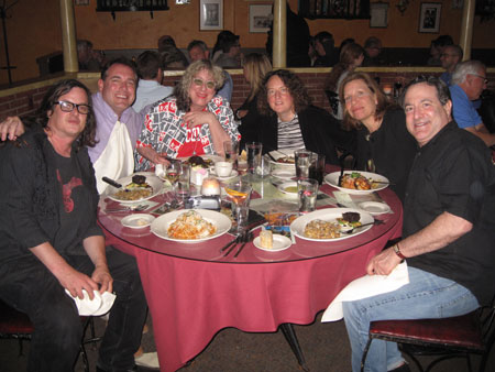
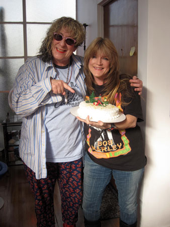
I forgot to take my usual close up photos of the seriously good food but thankfully I have this photo of who I ate it with there:
lombardos_2583

From L-R, Mark Blackwell, who traveled to Madison with me to shoot my conducting debut, Jon Sorenson, from the University of Wisconsin Foundation who came up with the idea of me conducting in the first place and had the good taste to choose Lombardino’s for dinner, me, Comm Arts Chair Prof. Susan Zaeske, Professor Mary Louise “Lou” Roberts, and David Bedri. We ate like the pigs that this kind of decor demands.

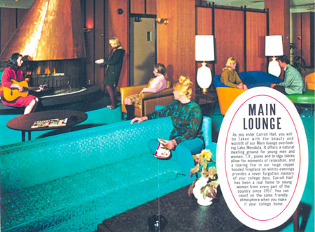
I appreciated Lombardino’s even more because I started off my Madison trip as I have the three other times I’ve been back since I graduated, by going to see my old dorm, Carroll Hall, a stone cold classic Atomic Age building I moved into my freshman year. Both the interior and exterior left a lasting architectural impression on me that continues to this day. Carroll Hall was a stunningly modern Mid Century building with a beyond to die for lobby. I still have the brochure that made me choose it as a place to live:
Carroll-Hall2

Though the building itself was a little too rectangular for my tastes, the steelcase windows and turquoise metal plates that matched the blue of Lake Mendota made me so swoon every time I rounded the corner to see it:
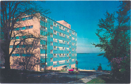
carrollhall-postcard

To my horror, here’s what it looks like now:
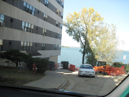
carroll-hall-redo_2586

Yikes! What are people thinking to just slop right over the gorgeous puppy?! Whatever material they used was so cheap you can still see the lines of the metal rods that held the turquoise plates in place. And then you go and paint it brown?! So it will disappear into the lake, not drawing attention to itself like some geeky coed?  At least the blasphemers were bold enough to make it striped but shades of beige don’t really help much. And it’s really cheap paint, the kind that gets sucked into whatever material it’s painted over and even 100 coats will never give it any presence. Which is exactly what the owners of Lombardino’s didn’t do. Which is exactly why the first place I’m going to eat whenever I hit Madison again is Lombardino’s!
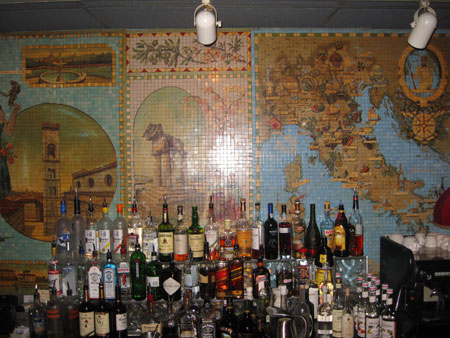
lomdardos_2585

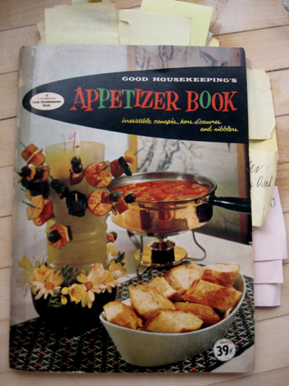
Appetizer-book_2906

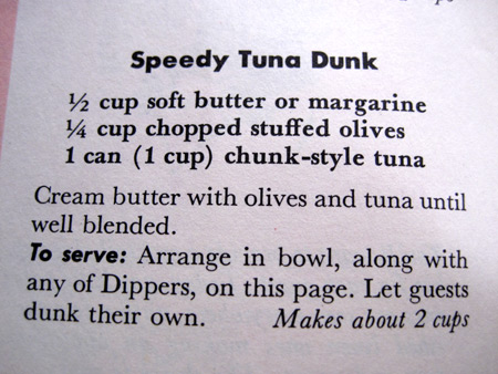
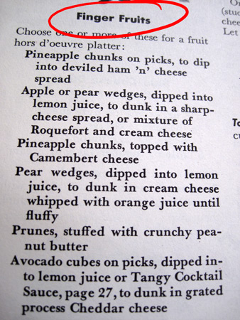
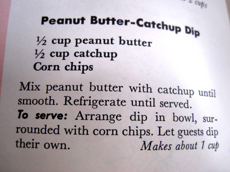
By the number of post-its that I’ve stuck in this book, 41 to be exact, it’s obvious that I’m as much a fan of the recipes in this hallowed hors d’oeuvres bible as the typical housewife was in 1958 when it was published by Good Housekeeping magazine and the Hearst Corporation. The fact that thanks are given to companies like Frito, Borden, the Hawaiian Pineapple Company, Lawry’s, the National Biscuit Company, Ralston Purina, Swift and the Shrimp Association of the Americas should be a great indication of the junk-tipped treasures that lie within. I have long followed the advice of this book when throwing small dinner parties, well, at least small parties for me, 10 to 20 people, and if you happen to be cooking this lovely Sunday afternoon or evening and haven’t decided on the menu yet I suggest you do the same.

Appetizer-book_2900

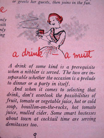
I don’t drink but any good hostess knows that keeping your guests in the state of mind they most like to be in, happy, one should always have plenty of these on hand:

Appetizer-book_2891

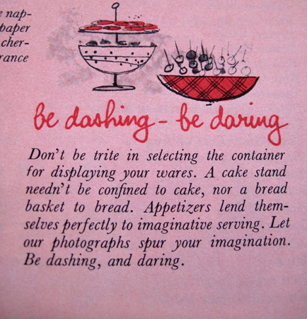
Never forget that what you serve a dish in is just as important as the dish itself. Party moods are all psychological and what something looks like effects perception.

Appetizer-book_2892

No plain white ones of these please:

Appetizer-book_2893

What makes me happiest of all about the Appetizer Book is that the people at Good Housekeeping chose to call appetizers “nibblers”.  I have always loved the word “nibble”.  So much so that when a cat had two litters of kittens 55 days apart on my roof I caught her and named her “Nibbles”.

Nibbles_7835

As you can see, her tail is a little “nibbled” on:

Nibbles_4047

I named her daughter, who I also caught,  Niblet:

noblet_2688

The simple truth this Sunday is that I’m on excruciating music and video deadlines so I’m going to leave you now in the good hands of the folks at Good Housekeeping. I’ll start with one of my favorite chapters:

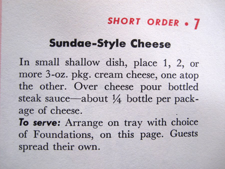
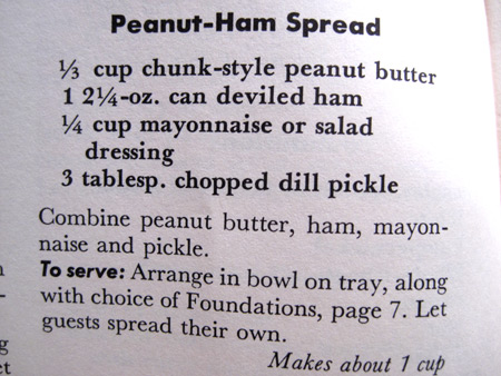
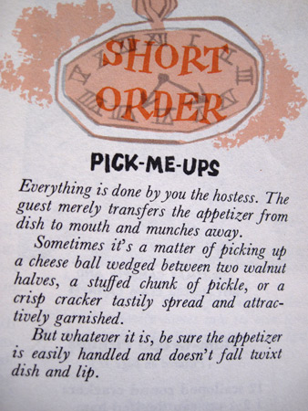
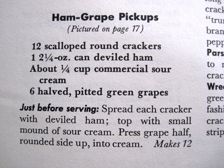
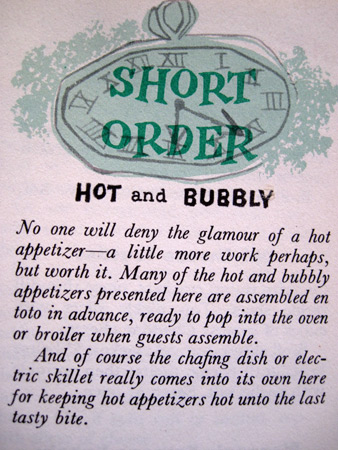
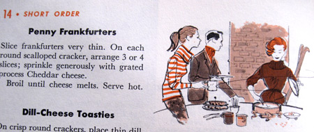
Appetizer-book_2894 Appetizer-book_2895 Appetizer-book_2896 appetizer-book_2910 Appetizer-book_2897 Appetizer-book_2898 Appetizer-book_2899 Appetizer-book_2901 Appetizer-book_2902 Appetizer-book_2903 Appetizer-book_2904

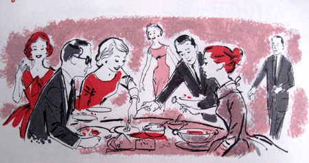
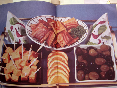
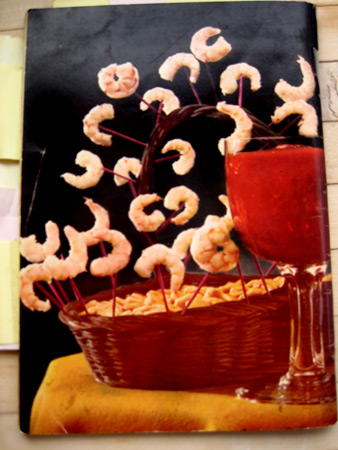
How could a cook book have a more beautiful centerfold than one that features fried saltines wrapped in bacon, cheese cubes with drippy white things on the toothpicks and a bowl of mixed olives decades before it became de rigueur to have one on your appetizer table?

Appetizer-book_2909

I hope you’re all having a very happy Sunday and enjoying some of these lovely nibblers. I’m going to pet Nibbles and Niblet and get back to work, but not before I eat some of these:

Appetizer-book_2907

Love-coasters2_4235

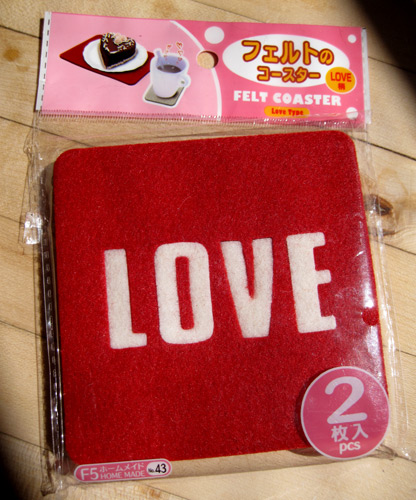
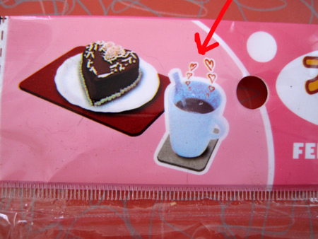
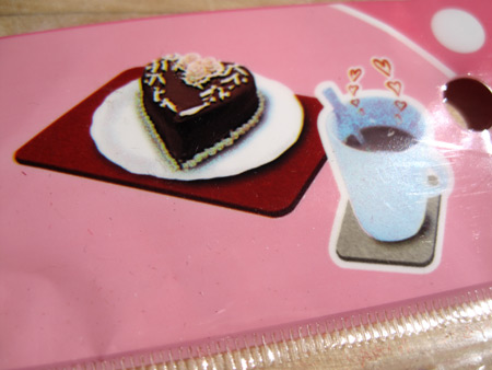
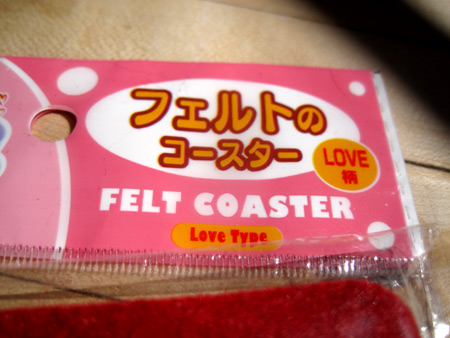
It’s always a good sign of kitsch when right off the bat the packaging describes the product wrong.  On the top of the package it very clearly states that I will be getting one Felt Coaster Love Type. But a few inches lower it clearly says that I will be unwrapping two Felt CoasterS Love Type. Perhaps the designer of the label was too excited at the hearts leaping out of the coffee cup to go for accuracy in the product description.

Love-Coasters_4229

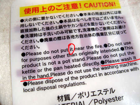
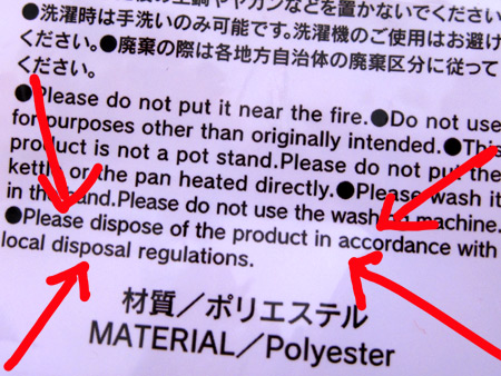
The back of the package states “Please do not put IT near the fire”.  Does that count for both its, as in two coasters, and in that case shouldn’t it be “them”?

Love-coasters_4241

On the back of the package there are several warnings the user of the Felt Coaster Love Type must heed.  Especially important is “Please don’t wash it in the hand”. Which of the hands should i not be washing it in?

Love-coasters_4242

The directions also clearly instruct not to use your Love coaster as a hot plate. At least I think that’s what this means:

Love-coasters3_4242

Then there’s this somewhat distressing warning:

Love-coaster_4230

Is the Felt Coaster Love Type full of nickle, lead or battery acid or something?  I’m not sure I want anything like that in the vicinity of anything hot OR human.

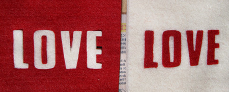
I do love the look of these things. Nice bold letters looking like they would in a nice heavy letter sweater.

Love-Coasters2_4250

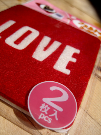
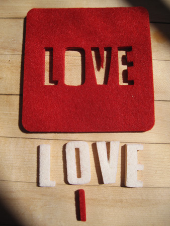
The letters are actually the best feature of the Felt Coaster Love Type though their specialness isn’t even mentioned on the label. All the letters pop out.

Love-coasters_4244

I can’t imagine the purpose of the pop out letters. You certainly can’t balance a glass on one of them though they probably could  handle the last bite of toast.

There’s a couple more things that are outstanding about the Felt Coaster Love Type.  The leaping heart coffee cup and slice of cake are sitting on two different size coasters yet there are only two 4″ square coasters in the package.

Love-Coasters_4251

The red “coaster” that the cake is sitting on isn’t even rectangular, which means that two of the “coasters” couldn’t be stuck together to make one larger “place mat”, not to mention that the package contains two different colored “coasters” so they could never be combined to make the larger one the cake’ sitting on.  It’s nutty in the first place that a piece of cake on a plate would have to sit on top of a coaster. And even if this were an optical illusion and this were, in fact, a coaster, the plate  that would fit on it could only be 3″ round, which means that the piece of cake is only about a tablespoon big.  And even if it’s a little teacake I don’t like eating off of doll dinnerware.

The Felt Coaster Love Type was produced in China for Daiso, Japan. I will faithfully follow the instructions and promise to never use it “for purposes other than originally intended”.

Love-coasters_4237