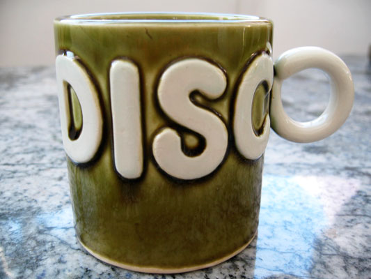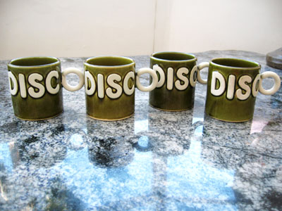
I’m a monster fan of integration be it a business strategy, department store or coffee cup design. The integration of the ‘o’ from ‘Disco’ into the cup handle is genius to the point that the monster mistake made is excusable. That drippy moss green ceramic glaze is vintage Hippie, as far away from a Disco color scheme or technique as imaginable. Which kicks this cup even higher on the Kitsch scale than cup design alone.


