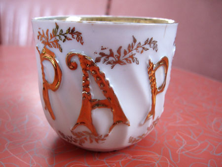
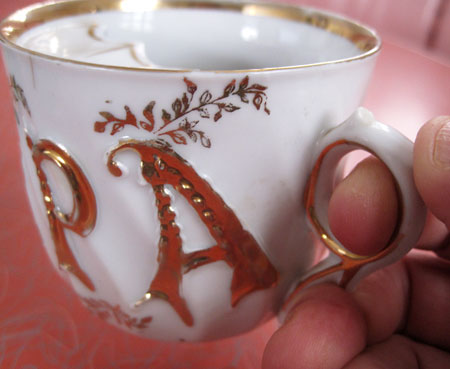
I have a problem with lettering on cups when the word is short yet from no angle on the cup can you see the entire word.
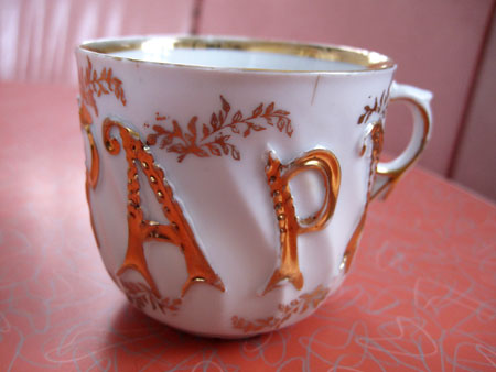
And I always think that cup manufacturers cheese out when they don’t spring for anything printed on the back. The last time I looked there were more righties than lefties, which means that ‘Papa’ is ignored the lionshare of the time.
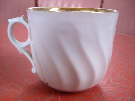
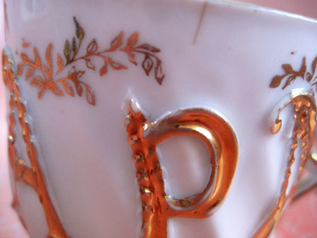
The little leaf pattern seems a tad too delicate for ‘Papa’.
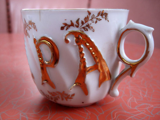
And speaking of that which is not entirely masculine, let’s discuss the handle of this cup:
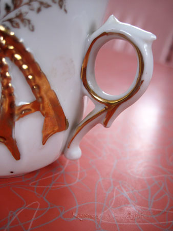
In addition to being a little froufrou, those sharp little bits of ceramic sticking up dig into the back of your thumb and side of your middle finger like little knives, making it impossible to hold this as one would naturally hold a cup lest you risk puncture wounds.
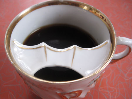
I know that ceramic piece stretching across the inside of the cup is to keep ‘Papa’s’ mustache out of his coffee. But this looks much more like a bat to me and if I were ‘Papa’ I wouldn’t be so happy about my lips resting on an animal often confused for a rodent.
And what are all those brown spots at the bottom?
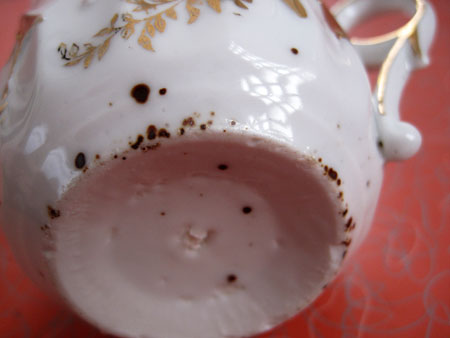
They’re embedded deep in the glaze and I have no idea how they got there as it’s a completely different color than the gold that graces the rest of ‘Papa’s’ cup.
Hopefully you have fewer gripes about your father than I do about this cup. If so, please wish ‘Papa’ Happy Father’s Day for me!
